I miss the old Map of the Market which was online since 1998 and was one of the first visualizations on the web.
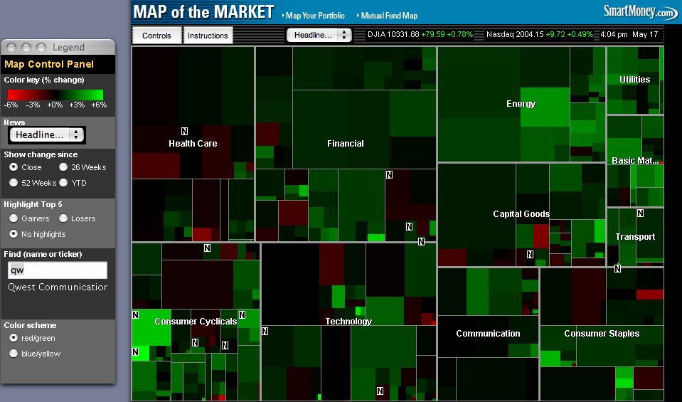
This was long my go to site for a quick update on how the market was doing. Who is up, who is down, and why? It seems SmartMoney has sold out and removed it. Perhaps after 15 years, and since it was build with Flash, the time had come.
That left me looking around for a replacement. I found this one at FinViz
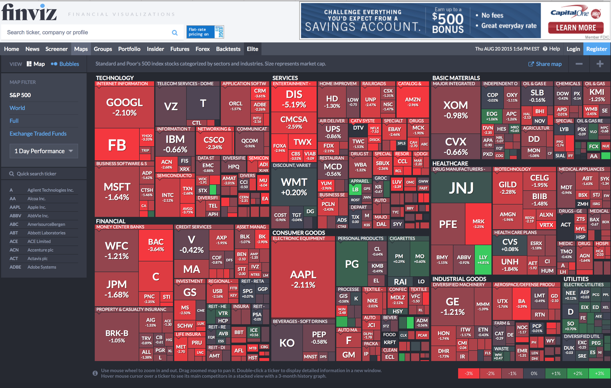
Each square is sized according to it’s market capitalization (the relative cost to buy every share at its current price). As you can see, you can buy about 2 Googles or 3 ExxonMobiles for the price of 1 Apple. When you see the market like this you get a sense of how big (of over/under valued) some of these stock might be. Another cool feature of this chart is the Bubble view:
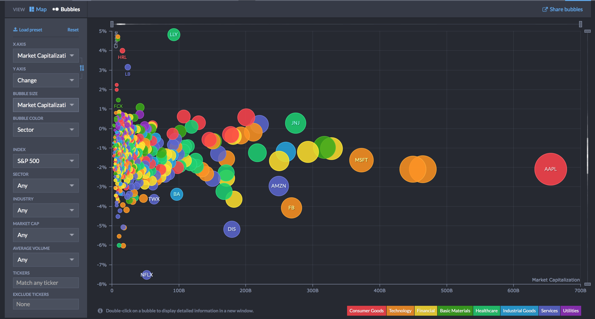
This shows how far from the pack Apple is. When you zoom out to see more of the world you can see how big the stock market has become.
What I was interested in is the Health Care sector which as you can see bigger than Industrial Goods (the so called Military Industrial complex), bigger than Oil
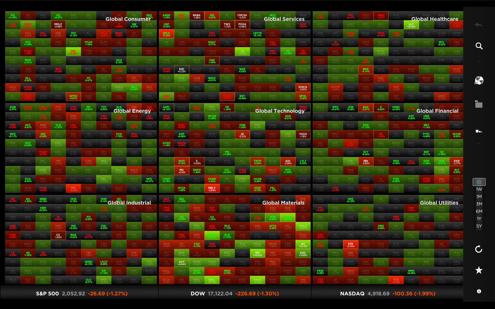
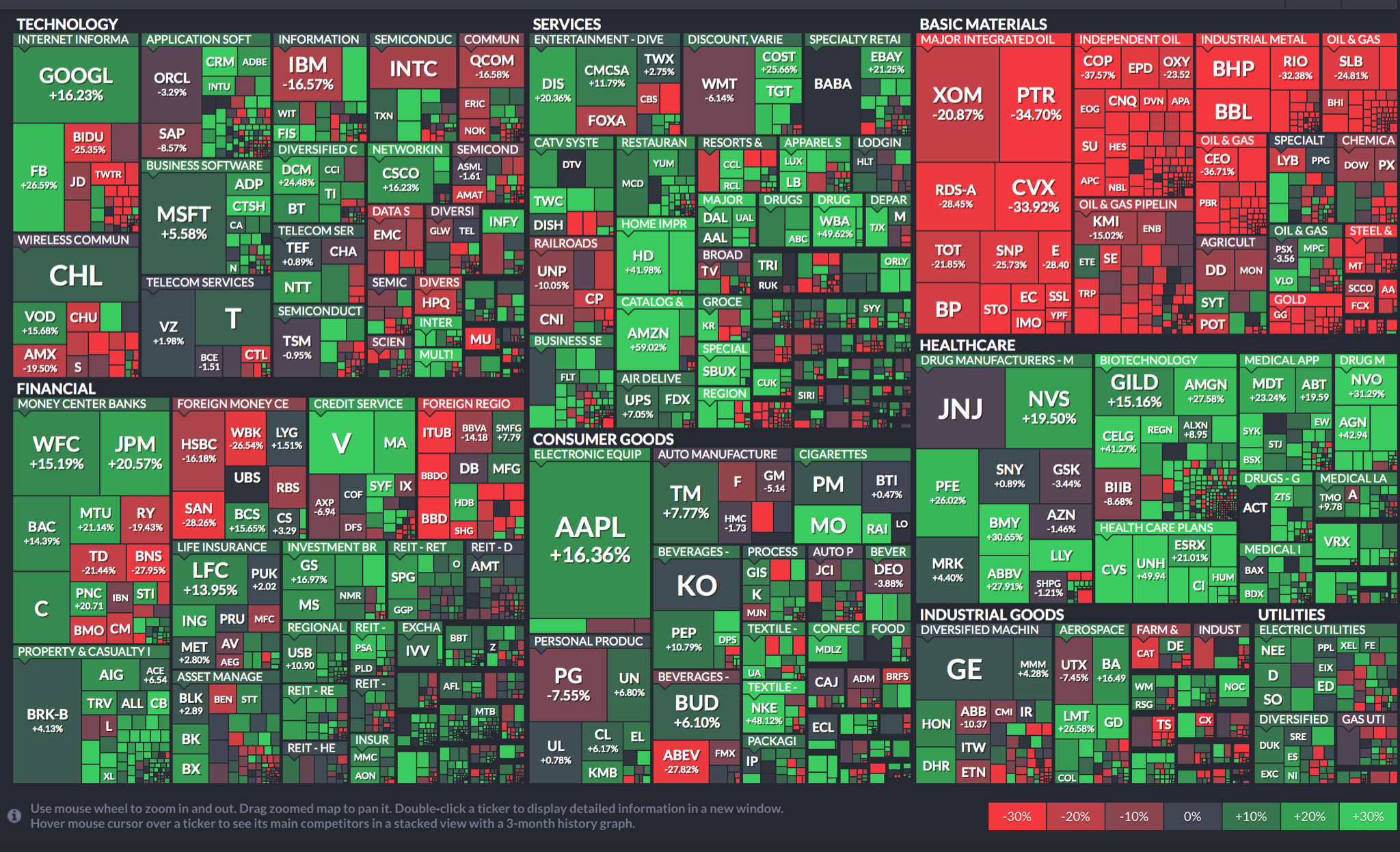
Below is a screenshot from the desktop tool StockTouch which, by the way, I discovered when it was an editors choice in the Apple App Store. It has a good interface to drill deep and read the news, but the one thing I miss about the original is how it showed the relative size of each industry and stock. This chart treats them all as equals (if the make it into the top 100 that is). I would not recommend this for OS X – it worked fine on the Ipad.