
Now that I have all my old email in one place, my next project will be to create some visualizations to start analyzing it. What do I mean? I’m talking about graphs, charts, tables, heatmaps, grids, networks, etc that illustrate patterns in the email. For example – I have roughly 40,000 emails (closer to 20,000 or so were sent by an actual human, and fewer still were sent only to me – but I don’t know for sure and thats part of the problem). My goal is to have a set of Thunderbird plug ins that will allow me see patterns like these. These are 7 visualizations I think Thunderbird (or Gmail) needs. If I get a lot of interest, I might actually build them so let me know what you think in the comments (no registration needed but I do moderate so it might not show up right away).
- Report 1: social network – How many people are in my social network? – Unique names are pulled from the To, From, CC, and BCC fields – the total counts for each are shown. A tag cloud is created showing all the names. Overall, the names are evenly spaced out – but when 2 names appear in the same email, they are more related and grouped closer together. The more often names appear, the more larger and bolder they get. The cloud can be filtered to show only data from the to, from, cc, or bcc feilds or to show activity for a given period of time. Lines with arrows can be turned on to show the origin, destination and direction of email.
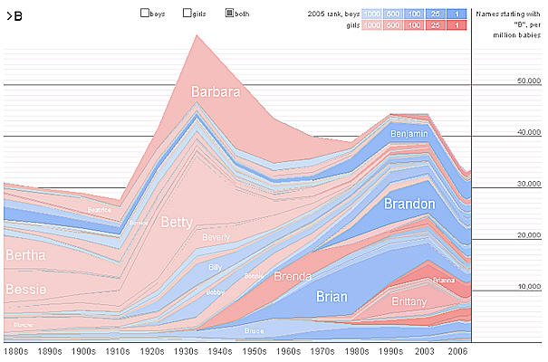
- Report 2: A River of email – OK – so I know you are all familar with NameVoyager. No? Its a dynamic graph of Baby names (see screenshot below). Imagine the same thing for your email – years on the bottom, blue is received, pink is sent, you type a letter and the list is filtered (second screen)
.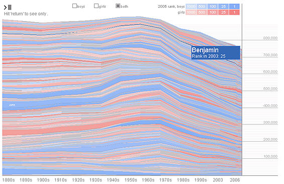
(All Email – with count per year, per person – you can zoom in to see by month, or filter to see a given name)
This activity over time (a graph showing the peaks and valleys of overall emails sent and received). It will be interesting to see email drop off at the holidays, peak when I’m on projects with large teams, and drop off when I am working with small teams or not on a project) - Visual 3: Company wide graphs – Once I can do this, it is a small step to analyze not only mine, but a whole company’s email. This lets me build social networks. Who knows who? How well connected are they? Need to get introduced to someone – did you know your friend worked with him two years ago?
- Visual 4: Integrate with your contacts – zoom out to see all your contact at once with a color indicating your activity with that person. Or just be able to sort by most popular.
- Visual 5: Build a tag cloud of words you use in all your messages (like manyeyes.com). Show topic popularity this way.
- Visual 6: Building on the data from visual 5, build a tool like google trends that uses words as they appear in email. This would show the topic trends.
- Visual 7: World map of email sources – using server source show the geographic location of people who have sent you mail.
Of course many other visuals are possible using other attributes over time (word count, attachment size, tags, etc).
Does anyone out there have something like this already? Working on it? What other plugins are needed? And most importantly, who wants to help 🙂
I just randomly stumbled across your blog – that is a totally awesome idea and I for one would love to have something like that available! I don’t have the technical skills to be able to do anything so will leave t to those who do… Good luck with it all 🙂
About #2: see the “mountain” project from Fernanda Viégas:
http://alumni.media.mit.edu/~fviegas/projects/mountain/
Thanks #2 – This link to the mountain project is very interesting. I was hoping there was a way to download the code and try it out. Maybe they will package this up sometime. It is almost exactly what I was describing. Thanks!
One of the Google Reader engineers, Mihai Parparita, has tried something similar: see “Mail Trends” (http://blog.persistent.info/2008/03/mail-trends.html)
Wow. that’s amazing, I had no idea someone would want to do something like this, but now that you mention it… I would certainly be interested.
Your visualization ideas are awesome!! Are you still working on them?
Since you are aware of the power of visualization, let me talk to you about another visualization must-have:
a customizable graph for the adress book contacts.
There was an app for Outlook some years ago:
http://edward.de.leau.net/what-happened-to-cortege-the-outlook-contacts-social-network-extension-20081026.html
(the graph here is way too rigid, as you can see, but at least it’s a start)
The idea is to have lines connect the contact images, so that you can see who is connected to whom.
Ideally, the graph would self-arrange itself or at least let the user drag the contacts, so that the connection lines don’t overlap to much.
I’m wondering why nobody sees the interest in creating such a plugin or app.
That’s one of the most useful things you can do with your adress book contacts …
🙁
If you or anyone else knows of any alternatives to abovementioned program – if
possible working with Thunderbird – then please post a reply here.
Thanks.