When you write content, normally you do not have to worry about the length of your sentences (unless you are on Twitter). Most web pages and applications you use will automatically wrap your sentences when you get to the end of the page. But as a designer, it IS your job to worry about this and every other detail that effects how the page is used, read, and understood. There are many factors that effect the readability of text on the web:
- Font selection (Ariel, Helvetica, Comic Sans)
- Size of the font (10px, 12px, 50px)
- Color and contrast (Black is readable on white, not on black)
- Spelling and Grammar (my old grade school nemesis)
- Word choice, idea density, complexity, image usage, grammar, language, etc…
Each of these deserves its own post. But today I’m talking about line length. Having the right amount of characters on each line is key to the readability of your text. How wide should a column of text be, to optimize readability?
Short answer: approximately 55-100 characters depending on your audience and the medium! This is the common rule of thumb and from my own experience and research I agree with it.
The optimal line length for your body text is considered to be 50-60 characters per line, including spaces (“Typographieâ€, E. Ruder). Other sources suggest that up to 75 characters is acceptable. So what’s the downsides of violating this range?
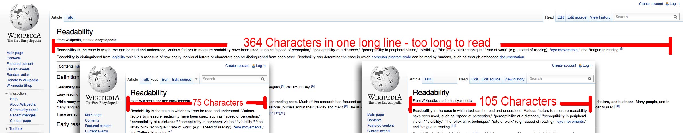
- If your text is too long – if a line of text is too long the visitor’s eye will have a hard time focusing on the text. This is because the length makes it difficult to get an idea of where the line starts and ends. Furthermore it can be difficult to continue from the correct line in large blocks of text.
- Too short – if a line is too short the eye will have to travel back too often, breaking the reader’s rhythm. Too short lines also tend to stress people, making them begin on the next line before finishing the current one (hence skipping potentially important words).
It turns out that the subconscious mind is energized when jumping to the next line (as long as it doesn’t happen too frequently, see above bullet point). At the beginning of every new line the reader is focused, but this focus gradually wears off over the duration of the line (“Typographieâ€, E. Ruder).
Technical manuals and academic papers are more densely written (although I wonder if this is to convey the impression of knowledge and complexity that might be undermined by a big, easy to read letters on the page). Â Smart people like to read things that make them feel smart. The pages of academic pages and published studies are densely packed with small fonts, but most still honor the rules of readability.
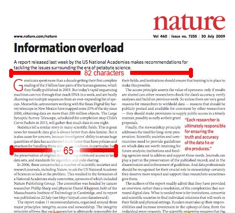
Nature: The International weekly journal of science; Most columns are 65 characters in length.
If its a children’s book, and you are teaching people to read, you might only have a few words per line (i.e “See spot. See Spot Run. Run Spot Run!”). Young adult books also have large fonts and thus fewer words per line – Charlotte’s Web is recommended for readers 9 to 11 years old and is on the low end of the scale at 55 characters per line.  Young readers need larger fonts and more space to separate each word for clarity.
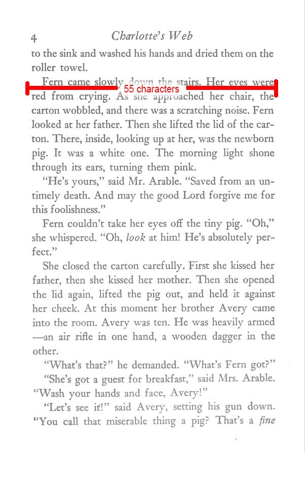
Children’s books like Charlotte’s Web use a larger font and only 55 characters per line.
Printed newspapers have the shortest columns widths of printed material with 25-35 words in a column inch.
For centuries, page design has been influenced by the so called “golden ratio”
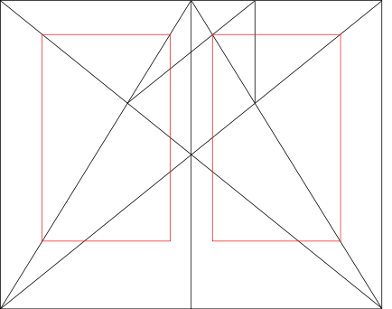
The golden ratio as applied to page margins and width is used in many books.
When the Renaissance genius Leonardo_da_Vinci put pen to paper he did so with a careful observation of the golden ratio.

Da Vinci was obsessed with the golden ratio but not readability, all the text was written in a mirror image with 85 characters per line.
Early printed books used “justification” to get exactly the same amount of characters per line by breaking words with hyphens and varying the amount of spacing. This makes the page look better but its not always the best for readability. Automatic justification in programs like Microsoft Word is even worse for readability because it can create huge gaps in the sentence and the brain has to work harder to read them.
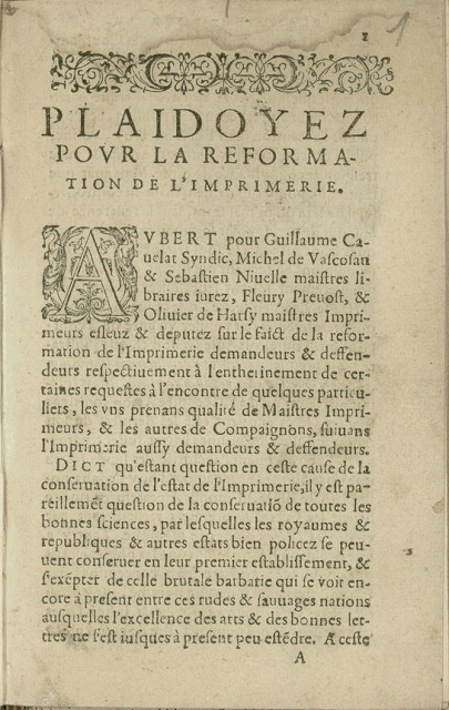
Early typeset printed documents fudged the spacing to “justify” the margins (50 characters per line)
Some other considerations:
- Search engines prefer titles with 70 characters or less.
- Plain English recommends short sentences. Robert Gunning faults marathon sentences in his book How To Take The Fog Out Of Writing. Though he admits to the possibility of long sentences being balanced and readable, he notes that only highly skilled writers such as Charles Dickens and Thomas Wolfe can write a marathon sentence with clarity. He adds: “But even these accomplished writers produced marathon sentences only occasionally. On the average, they wrote fewer than 20 words per sentence.â€
- In an app or special device, like the kindle, you have the ability to completely focus on the text.
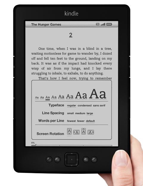
The kindle has 50 characters per line
My favorites:

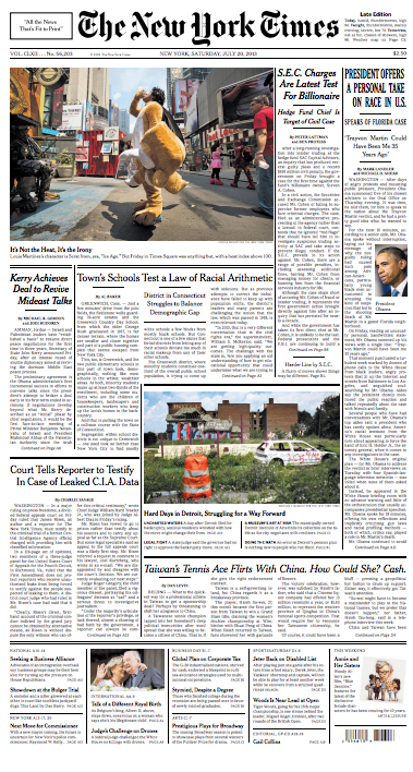
New York Times – 77 characters per line.

USA Today has 55 characters on lines next to images, and 85 on the long lines.
Conclusion
These are not absolutes, but when you look at the most readable sites and applications on the web, and by that I mean not the prettiest, or most aesthetically pleasing, because something can look great, and maybe have the impression of usability, but be difficult to use in reality. Sometimes I find myself looking at beautiful page, but not wanting to read the text. The following pages have great readability in my opinion. Keep in mind, if the content is interesting to you, you will find a way to read it no mater what the obstacles. But as designers, we should at least make sure we do not get in the way.

This is a great point, Ben; glad you made it. It needs to be repeated again and again and again. The 60 – 80
character rule has been a best-practice in print for years and we tend
to forget it. Just because our web browsers stretch to fill the
resolution of our screens, does not mean that we should allow our text
to do so. When the eyes reach the end of one line of text, they must
easily pick up at the beginning of the next. If your eyes have to travel
too far in this process, it’s easy to lose place.